
We're done with two more milestones [M3] [M4], introduced GAE support, visited great JavaOne event and finally I'm ready to continue this series in order to guide you through RichFaces 4 migration!! In this write-up I will review the migrated input components.
Inplace Components
rich:inplaceInput and rich:inplaceSelect components are almost unchanged from a usage point of view (we want your migration to be smooth :) ). However, the markup and client-side code, which was the cause of number of issues raised by the community, were completely reviewed and rewritten.
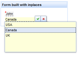
So, meet the well-known inplace components in RichFaces 4:
<rich:panel style="width:220px;">
	<f:facet name="header">
		<h:outputText value="Form built with inplaces"></h:outputText>
	</f:facet>
	<h:panelGrid columns="1">
		<rich:inplaceInput defaultLabel="click to enter your name" />
		<rich:inplaceSelect defaultLabel="click to choose your country"
showControls="true">
			<f:selectItem itemLabel="USA" itemValue="0"/>
			<f:selectItem itemLabel="Canada" itemValue="0"/>
			<f:selectItem itemLabel="UK" itemValue="0"/>
		</rich:inplaceSelect>
	</h:panelGrid>
</rich:panel>
And the result:
You can choose the events which will activate the editing and storing, configure advanced settings like storing on blur, add disablement conditions, add UI controls for applying values, and so on. Also, the components support navigation and control using the keyboard.
Input Number components
Let’s check one more pair of components which have also been migrated with minimal changes to RichFaces 4.x. It’s the also well-known rich:inputNumberSlider and rich:inputNumberSpinner components. The most noticeable change (except markup optimization) is that keyboard navigation is greatly improved from the 3.3.x version. We removed some unnecessary cases of getting focus from internal controls (the buttons in the spinner), and made some of the parts additionally focus-able (the slider element in slider). The first change was done because you already could change the value with the up and down keys directly. The second was done because the text input is, in general, not required, and could be hidden for the component, using the horizontal slider for input. The usage of left and right arrow keys in the text input could not be processed in the same manner as they should work for cursor change.
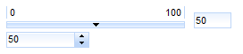
So let’s check the code which you used in 3.3.x:
<rich:inputNumberSlider value="50" />

<rich:inputNumberSpinner value="50" step="10"/>
And the result:
Combo vs SuggestionBox – unified rich:autocomplete component
In 3.3.x we had two separate components (rich:suggestionBox and rich:comboBox) for simplified input with autocomplete support. Both of them provided similar functionality but worked in different modes (one used Ajax and the other worked completely on the client). The second difference was that suggestionBox was able to be attached to any input and comboBox had the input and button built-in. So, after pre-migration redesign, we decided to create single rich:autocomplete component with all the features combined. The only feature it lost was the ability to be attached to any input, but we are planning the introduction of using behaviors for such components after the final release.
The most important attributes to define the usage are as follows:
- mode attribute. The client and ajax values are well known to 3.3.x combo and suggestion component users. Also in 4.x, we are introducing the new cachedAjax mode! It is used when you prefer to load suggestions using Ajax when the component is actually activated, but do not perform any reloads after further input clarifications.
- autocompleteMethod and autocompleteList attributes. Both of these attributes define the endpoints for data-fetching by the component. A method attribute should be used if you want to generate suggestions dynamically according to the prefix entered (suggestionBox variant), and list should be used to point the component to static list of strings. Both attributes work in any mode. For client and cachedAjax mode, further suggestion-filtering is done at the client-side by the built-in component or a custom filter function.
- layout and fetchValue attributes. Instead of the default built-in list of strings and a simple div-based layout, you could choose to use custom objects and a table or list layout for presentation by using the layout attribute. For example, you could show the suggestions list in a more convenient and informative way with a few columns of details. In that case, the fetchValue attribute should be defined in order to determine what to insert during selection from the table.
All the other attributes came from the suggestionBox and comboBox components, and are well known to those who used the components in 3.3.x: fetchValue, tokens, autofill, minChars, selectFirst (previously selectFirstOnUpdate) and so on.
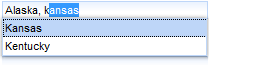
Let check some samples. The first is a simple autocomplete in cached Ajax mode which requests suggestions after the first character is entered. It supports the entering of comma-separated strings.
Code:
<h:form>
	<rich:autocomplete mode="cachedAjax" minChars="1" tokens=","
		autocompleteMethod="#{autocompleteBean.autocomplete}" />
</h:form>
And the result:
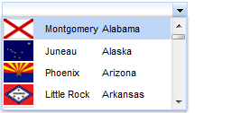
And the second sample. Here you can see custom objects and table layout usage. Pure client-side suggestions are taken from the list objects used. Also there is an additional button on the input to show the suggestions.
Code:
<rich:autocomplete mode="client" showButton="true" layout="table"
	autocompleteList="#{capitalsBean.capitals}" fetchValue="#{cap.name}" var="cap">
		<rich:column>
			<h:graphicImage value="#{cap.stateFlag}"/>
		</rich:column>
		<rich:column>
			<h:outputText value="#{cap.name}"/>
		</rich:column>
		<rich:column>
			<h:outputText value="#{cap.state}"/>
		</rich:column>
</rich:autocomplete>
And the result:
Select component
Great news! You no longer need to use suggestionBox suggestObjects feature, which has limitations and is not native for input in 3.3.x). And you are no longer required to create more complex converters, as with the 3.3.x comboBox, in order to transform the label (which was only supported in selectItem) to an actual object value. In 4.0 Milestone 5 we are introducing the rich:select component!
The select component has a direct keyboard-input feature and unified skinning for any browser, unlike the standard selectOne component, yet it works completely the same as the standard component under the hood!
It’s pretty simple from a functional point of view. You can type directly into the text input and it will suggest one of the selectItems which suits the current input. Also, you can just choose from the list, restricting direct input as for a normal select. For incorrect input, the current value will not be validated successfully as for the normal select component.
Let’s check in the code:
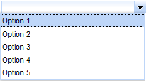
<rich:select>
	<f:selectItem itemValue="0" itemLabel="Option 1" />
	<f:selectItem itemValue="1" itemLabel="Option 2" />
	<f:selectItem itemValue="2" itemLabel="Option 3" />
	<f:selectItem itemValue="3" itemLabel="Option 4" />
	<f:selectItem itemValue="4" itemLabel="Option 5" />
</rich:select>
Rendered as a standard select without direct typing support:
And this one:
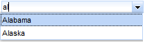
<rich:select enableManualInput="true" defaultLabel="start typing for select">
	<f:selectItems value="#{inplaceSelectBean.capitalsOptions}" />
</rich:select>
Accepts user input using keyboard:
Calendar
The rich:calendar component was also migrated with few changes from a functional point of view. It still has the following main features:
- Pop-up and inline modes
- Ajax and client month scrolling
- Client and server side dates disablement and styling
- ...
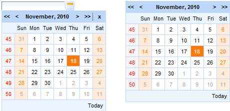
So let’s see some different states of calendars:
<rich:calendar datePattern="dd/MM/yyyy hh:mm:ss"/>
<rich:calendar popup="false"/>
Will look like:
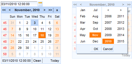
And after some manipulation:
The most noticeable difference that should be considered during migration is that we are planning to redesign our macro-substitutions-based templating. So for now, day markup redefinition is not possible, but it will be available in future after the base templating feature is done. For that reason, the data model has no getData for now, because it can't be used without templating.
One more note related to organizer creation using that component: after templating for cells becomes available, it should still be possible to implement simple cases as in 3.3.x. But there is a separate component in our plans related to pure organizer creation. The main reason for this is that most common cases for the content of day definition uses some repeats, dataTables, or lists (or any other iteration components), and those components require server-side rendering support. As such they can’t be done just using client templating.
To be continued...P.S. What on my way besides those articles
I'm proud to announce that me and Max Katz are starting to work on new RichFaces 4 book (Apress) to be published in the first half of 2011. I’ll be posting outline and more details later.
