
Thanks to everyone who participated in the Weld logo feedback :-)
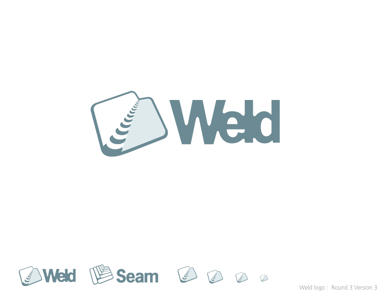
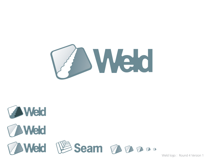
We had around 130 responses to the poll, and there was a strong consensus (75%) that we are following the correct path, with r3v3 and r4v1 sharing top place - I'll talk to Cheyenne, and see if she can bring out even more of the Weld beads from r3v3 in r4v1 :-)
Some general comments included:
The [r4v1] central part is better than the central part of r3v1
The r3v3 logo is the best, especially if you need a small logo. The other look unclear and bluring.
I prefer the subtlety of r3v1.
We also got some (negative) comments on the tight kerning of the typeface. So if you like this, then please speak up now!
Font for "Weld" might be a little too thick.
Use the same character spacing as for the Seam typeface?
The r4v1 logo looks great, however I think the text stuck together like that looks a bit sloppy.
I understand it is probably meant to signify the letters are "welded" together, but I feel that spacing between the letters would look better and be consistent with the seam logo.
The weld text looks cramped up. Not sure if its due to the font. If we can have it like the seam logo text spacing, I think that will look hot.
There were some comments on r2v6 (the flying sparks). This is certainly a favourite of mine, but quite simply, this won't scale to a small size well (something we need e.g. for IDE icons). However, be sure that we will use this motif in banners, desktop backgrounds etc :-):
r2v6 is nicer logo but r4v1 fits better with Seam
Standalone I definitely like r2v6 the best. The only downside is when you view it side by side with the Seam logo the former overpowers the latter. This effect might be mitigated by darkening the seam logo or by lightening the weld logo.
People had conflicting views about whether staying close to the Seam logo was good. We certainly see these as very closely related projects, and wanted to emphasize this in the graphic design:
Not liking the similarity between some of the weld designs and the current seam logo
I think its clever to stay close to the Seam logo.
wont this get confused with actual seam framework?
Maybe stagger the bumps so it's a little more reminiscent of the staggered 'zipper' from the Seam logo?
And some people were concerned about that the logo won't scale well. It's important to remember that these are just mockups and Cheyenne will do a lot of pixel-by-pixel fixing for the very small (icon) versions of the logo for the finished product:
I really like the clean look of the two welded sheet variants. The trick will just be getting the welding bubbles just right at different sizes. But I'm sure every time the logo is printed, that can be tinkered with.
r3v3 works best in low-res / tiny
As for the colouring, Option 7 had a strong lead over the pack, with Options 1, 2 and 8 closely grouped as the second choice. I also really like the colouring in 7 :-). Yet again, there were some good comments:
As for coloring, the bumps could be shaded to look like hot almost liquid metal near the front and get cooler towards the back. this seems more Weldish :-)
Really hard to choose :p
Avoid low contrast ones, the cyan looks too pale on white, and most of them are like that
The contrast between the two [metal sheets] makes it easy to distinguish the logo (weld or seam) without even looking at the symbol or reading the logo text.
Since we are trying to get the point across that these are two sheets of metal, we should probably avoid colors which are not metallic. I also think that having a color which complements the Seam logo is very important. Hence the choice for the dark gray.
Hopefully we will have a final result for you all to admire in the next week or two!
