This is an updated version of Making Eclipse look good on Linux that integrates the comments and the changes relevant for Fedora 8 (which I finally got around to update to).
I'm still bothered by the clumsy
look that Eclipse has on my Fedora box compared to how it looks on Windows and Mac.
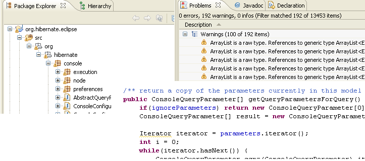
Eclipse 3.3 running on Windows XP

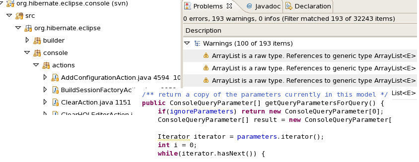
Eclipse 3.3 running on Fedora 8 (but looks very similar on other distros)

Notice that the font size is bigger ( 10 vs 8 ) and that there is a lot of extra spacing between elements (The package tree and problem view is much more compact on windows).
I tried changing the GTK themes but the issue prevailed - the themes doesn't seem to adjust the fonts only the component look
.
But with some help from my Red Hat friends on our tech-list I got some tips and ended up getting close.
The tweaks
Install Red Hat Liberation fonts if you don't already have them. They are free/liberated Windows fonts available for any OS and readily available in Fedora's repositories so they are very easy to install via /yum/.
After they are installed I ran /gnome-appearance-properties/ (/gnome-font-properties/ in Fedora 6) and used the following settings:
/Application/Document/Desktop font:/ Liberation Sans, size 9
/Window title font:/ Liberation Sans Bold, size 10
/Fixed with font:/ Liberation Mono, 10
/Font rendering:/ Best contrast (the others left weird artifacts)
/Under details:/
/Resolution:/ 97 dpi (to avoid the letters to get too close, need at least 1 px between them ;)
/Smoothing:/ Grayscale
/Hinting:/ Full
Depending on your Eclipse font settings the above will be enough, but if you already have tweaked some settings remember to check your Font settings under Eclipse preferences and verify that you are actually using the System default or the Liberated fonts to get the smoother more compact look. And finally, the above settings are much up to personal taste and they might even be different per distro since I had to use different values for F8 than for F6 to get what I liked.
The last thing is to remove some of that unneeded extra spacing in the tree views. The easiest way I found around that was to create an /~/.gtkrc-2.0/ file with the following content:
style "gtkcompact" {
GtkTreeView::vertical-separator=1
GtkTreeView::horizontal-separator=1
# Makes treeviews less spacy
GtkWidget::focus-line-width=1
GtkWidget::focus_padding=0
}
class "GtkWidget" style "gtkcompact"
Those settings will take effect when you restart Eclipse.
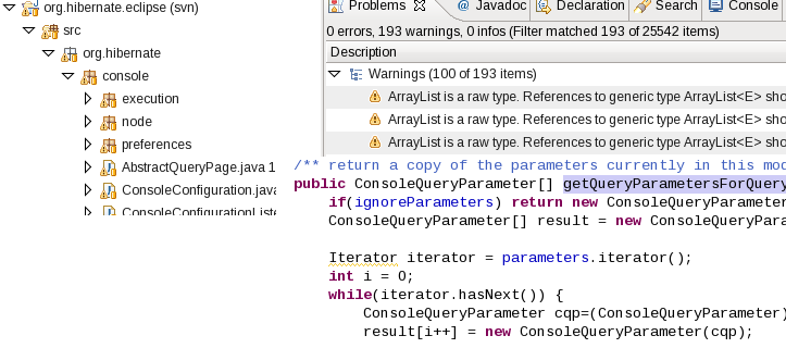
Eclipse 3.3 with Liberation font + tweaks

Much better, but unfortunately GTK still thinks it needs to have 1-2 extra pixels between the text in the tab components. If anyone know which gtkrc setting that can reduce that please leave a comment.


